Web Design | Wireframing
Objective
For this case study the objective was to create an e-commerce website for a camping gear company. The website would be used by campers of all levels. This means the brand has to appear clean and approachable.
Process
In order to understand what I was working with I created personas in order to understand the end goals for users.
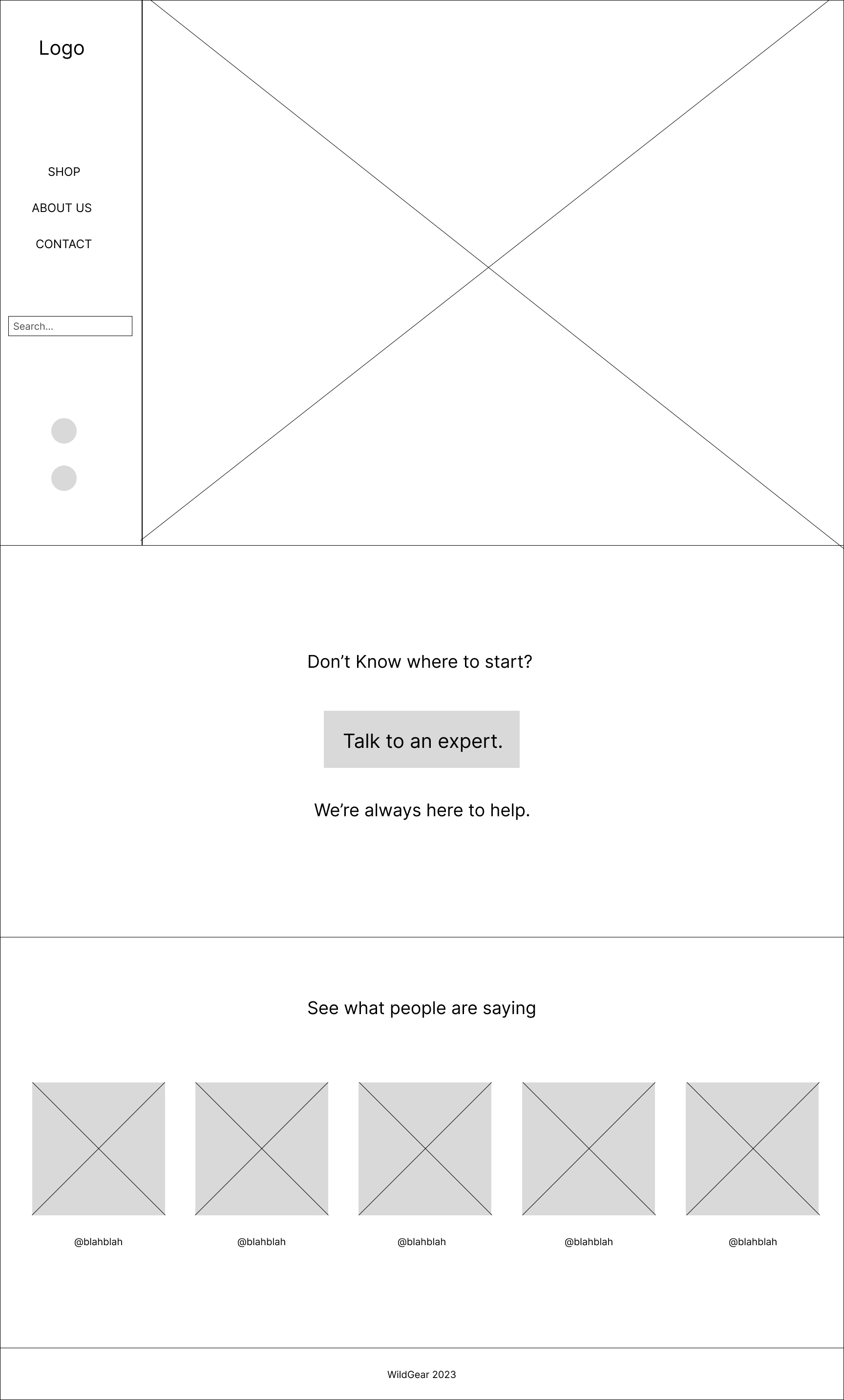
Based on the persona goals I added features such as the "Talk to an expert" button. A novice camper such as my persona 4 would like to make sure he's not getting unnecessary items and would like some guidance. The search function was implemented for people who know what they're getting and need to quickly access information.
The categories were put together based on researching competitor menus, and the Information Architecture was formed.
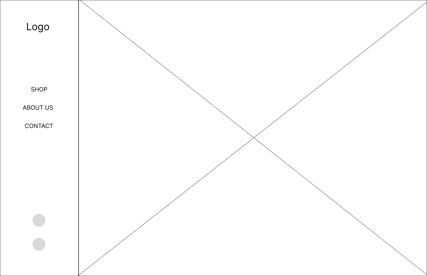
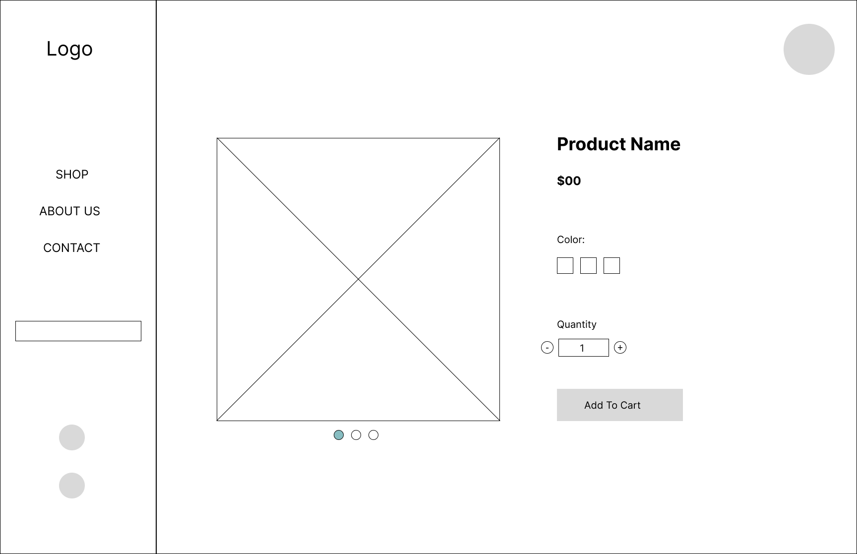
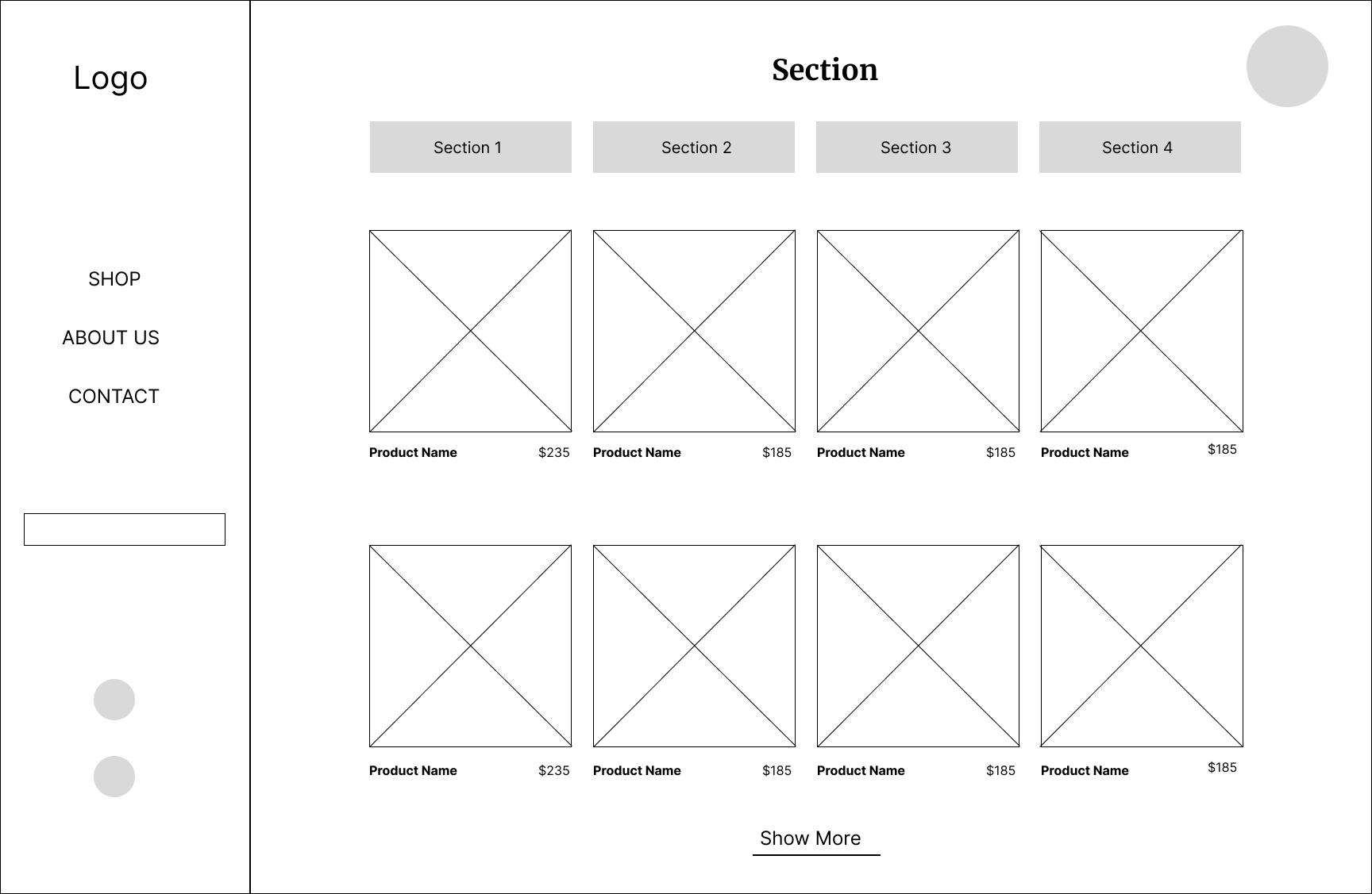
With the IA in order I proceeded to the wireframes. The following were chosen, as the layout felt modern, and with a sticky menu, the sections would be easily accessible.
Now the fun part. Designing the website!
I narrowed down the name to: Wild Gear
After the mood board, the logo was created using the compass star as the focal point of the logo. The sans serif was used to give a classic look, to add a timeless look to the brand. While the character of the serif makes it feel fun.
To keep the color palette simple I kept the main colors black and white and added pops of color with blue and yellow, representing the sea and the sun respectively.
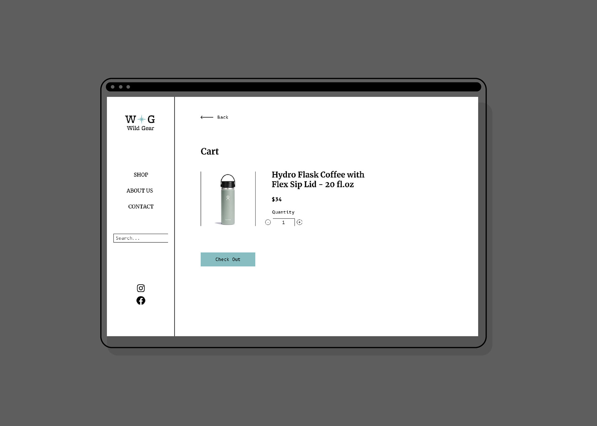
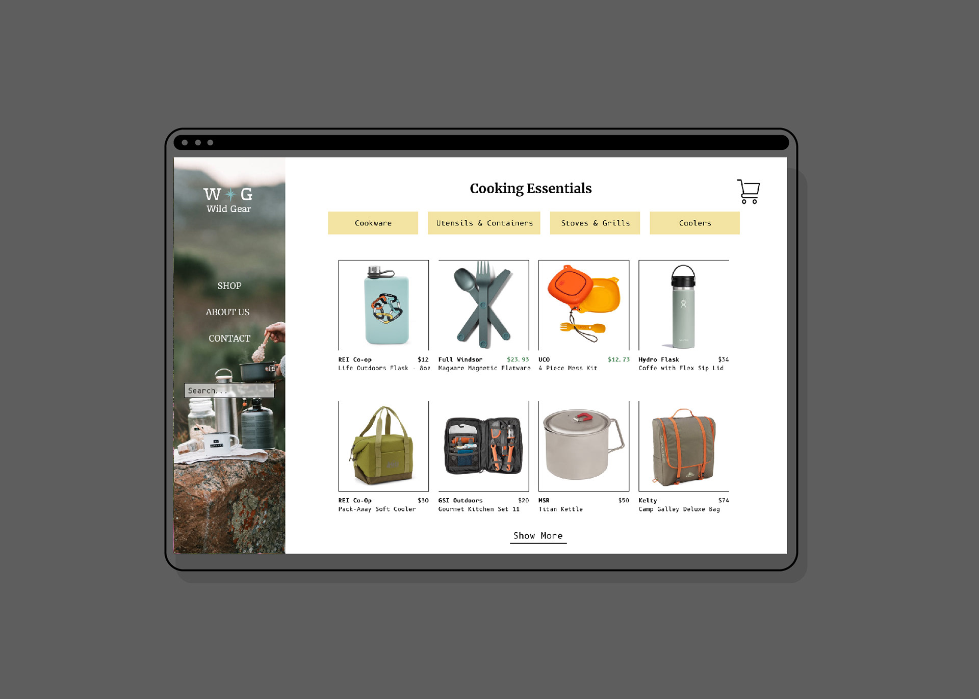
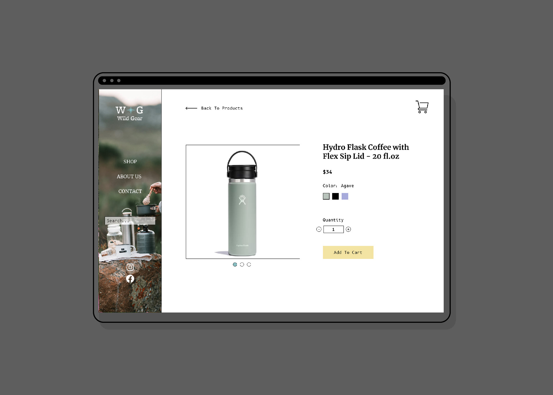
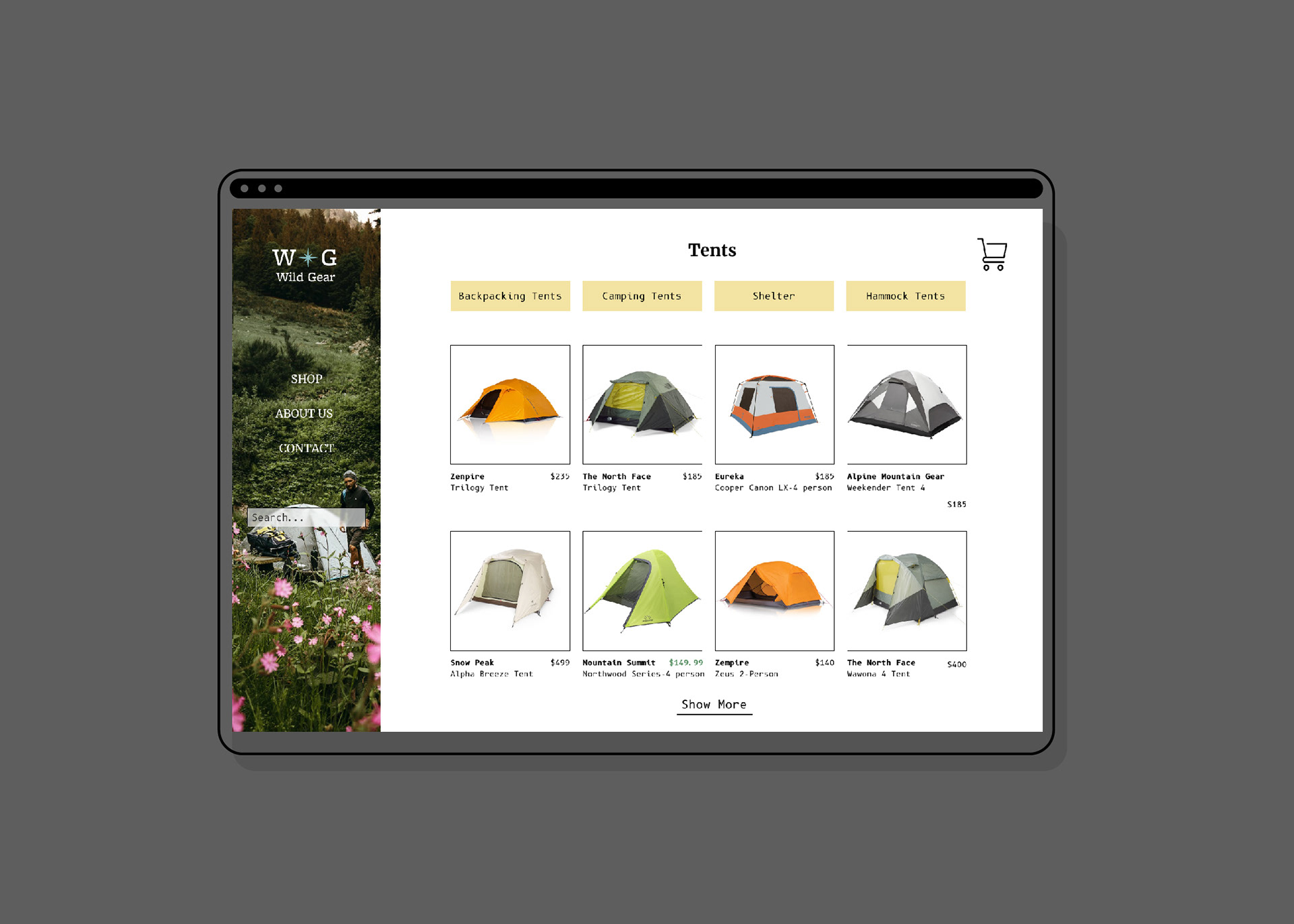
With the brand guidelines in place, the sticker sheet was easy to make. This made the design consistent throughout the entire website. The final results are below:
